Simplifying Complexity, One Dollar at a Time
Simplifying Complexity, One Dollar at a Time
Simplifying Complexity, One Dollar at a Time
How we ransformed a dense, data-heavy ROI calculator into a clean, intuitive dashboard for a workforce management company.
By prioritizing progressive disclosure, contextual color coding, and mobile-first design, we helped hospital administrators to save hours and boosted user efficiency due to reduced complexity.
How we ransformed a dense, data-heavy ROI calculator into a clean, intuitive dashboard for a workforce management company.
By prioritizing progressive disclosure, contextual color coding, and mobile-first design, we helped hospital administrators to save hours and boosted user efficiency due to reduced complexity.
How we transformed a dense, data-heavy ROI calculator into a clean, intuitive dashboard for a workforce management company.
By prioritizing progressive disclosure, contextual color coding, and mobile-first design, we helped hospital administrators to save hours and boosted user efficiency due to reduced complexity.
Client
Client
(Workforce Management Company)
(Workforce Management Company)
Project Year
Project Year
2023
2023
Project Type
Project Type
UI Design
UI Design
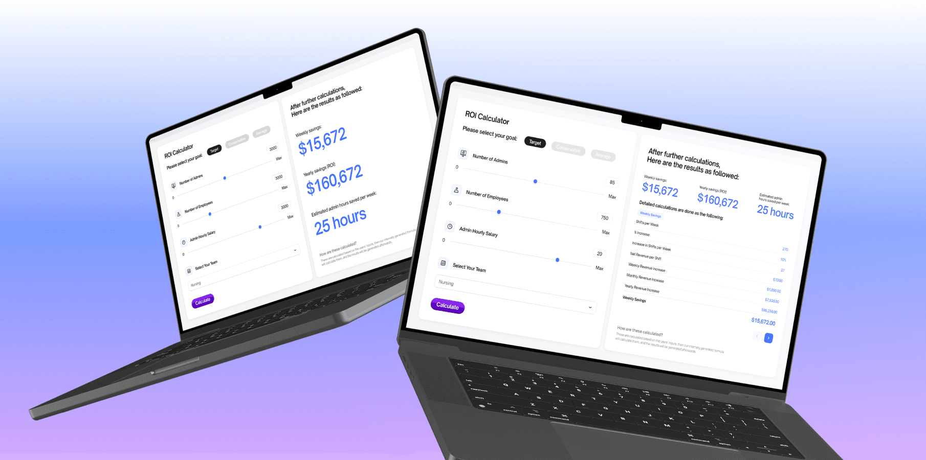
The client, a workforce management company, needed an intuitive ROI calculator dashboard to help hospital administrators quantify cost savings from their staffing software. Their existing internal tool dumped raw data into dense tables, overwhelming users with metrics like Weekly Savings, Yearly Savings, and Estimated Admin Hours Saved. The goal was to transform complex calculations (already developed internally) into a clean, actionable interface that prioritized clarity for time-strapped decision-makers.
Here’s how we achieved success:
The client, a workforce management company, needed an intuitive ROI calculator dashboard to help hospital administrators quantify cost savings from their staffing software. Their existing internal tool dumped raw data into dense tables, overwhelming users with metrics like Weekly Savings, Yearly Savings, and Estimated Admin Hours Saved. The goal was to transform complex calculations (already developed internally) into a clean, actionable interface that prioritized clarity for time-strapped decision-makers.
Here’s how we achieved success:
The client, a workforce management company, needed an intuitive ROI calculator dashboard to help hospital administrators quantify cost savings from their staffing software. Their existing internal tool dumped raw data into dense tables, overwhelming users with metrics like Weekly Savings, Yearly Savings, and Estimated Admin Hours Saved. The goal was to transform complex calculations (already developed internally) into a clean, actionable interface that prioritized clarity for time-strapped decision-makers.
Here’s how we achieved success:
Key Solutions
Key Solutions
Prioritzation of Input
Splitting of Panels
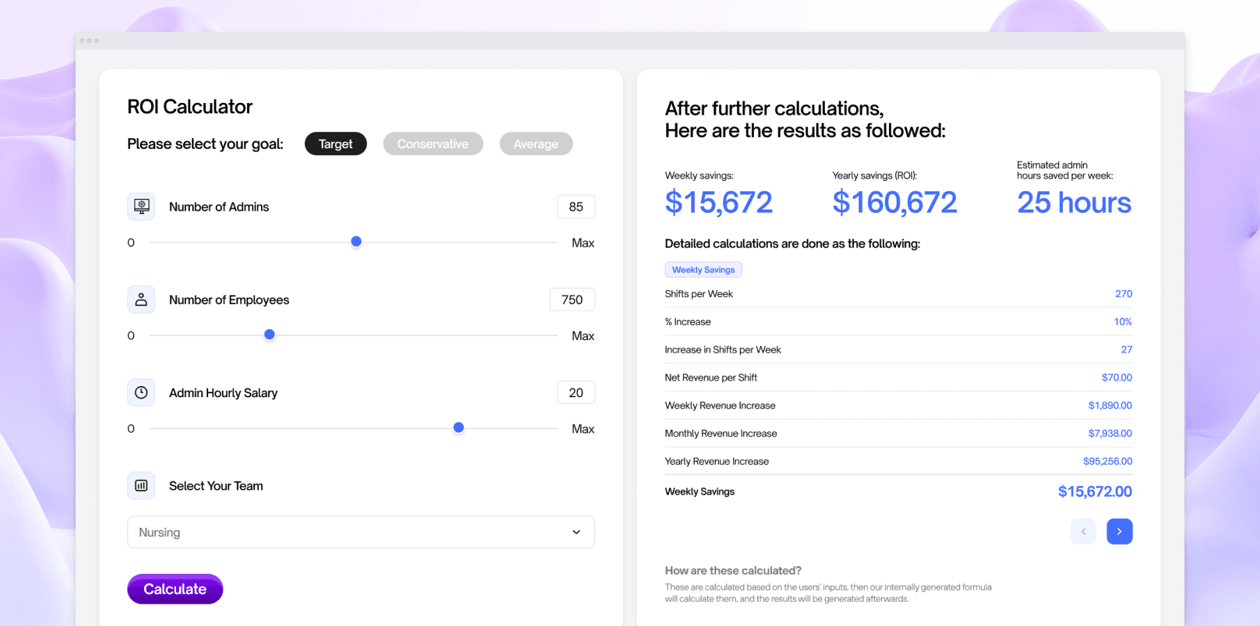
Mapped inputs (Number of Admins, Employees, Admin Hourly Salary) as dropdowns and sliders for quick adjustments. This is also done to avoid overload of steps required done by users.
Two panels - left and right, were created respectively for their purposes - the left one serves as user inputs, while the right one serves as result outputs, allowing each panel to serve their usage differently.
Splitting of Panels
Prioritzation of Input
Two panels - left and right, were created respectively for their purposes - the left one serves as user inputs, while the right one serves as result outputs, allowing each panel to serve their usage differently.
Mapped inputs (Number of Admins, Employees, Admin Hourly Salary) as dropdowns and sliders for quick adjustments. This is also done to avoid overload of steps required done by users.
Progressive Disclosure
Progressive Disclosure
Complex breakdowns are hid behind expandable menus when no user input is done, this can allow for potential decrease of cognitive load.
Complex breakdowns are hid behind expandable menus when no user input is done, this can allow for potential decrease of cognitive load.
Role and Process
Role and Process
Role and Process
As the UI/UX Designer, I translated formulas into a user-centric interface, ensuring technical accuracy without sacrificing simplicity. I've also ensured that the output will not result in cognitive overload towards users.
Research & Execution
Research & Execution
Research & Execution
Visual Research on Output
Visual Research on Output
The client requested to jump directly onto the visual process due to time constraints, however we also ensured that the user interface still follows the UX principles, this allows for added value without compromising on output quality.
The client requested to jump directly onto the visual process due to time constraints, however we also ensured that the user interface still follows the UX principles, this allows for added value without compromising on output quality.
Wireframe Testings
Wireframe Testings
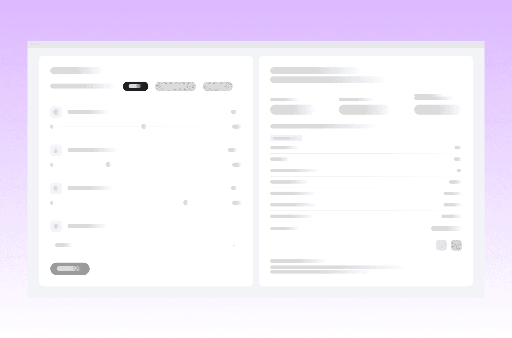
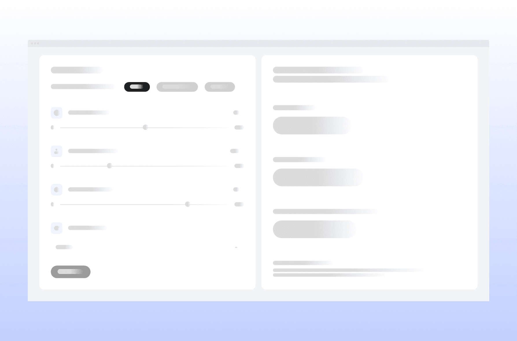
We provided two options for A/B testing for the client, the prototyped layout focused on the secondary table on the right, where one has a more cluttered layout to display full information, while the other one uses arrows for better viewing.
We provided two options for A/B testing for the client, the prototyped layout focused on the secondary table on the right, where one has a more cluttered layout to display full information, while the other one uses arrows for better viewing.
Added Transparency
Added Transparency
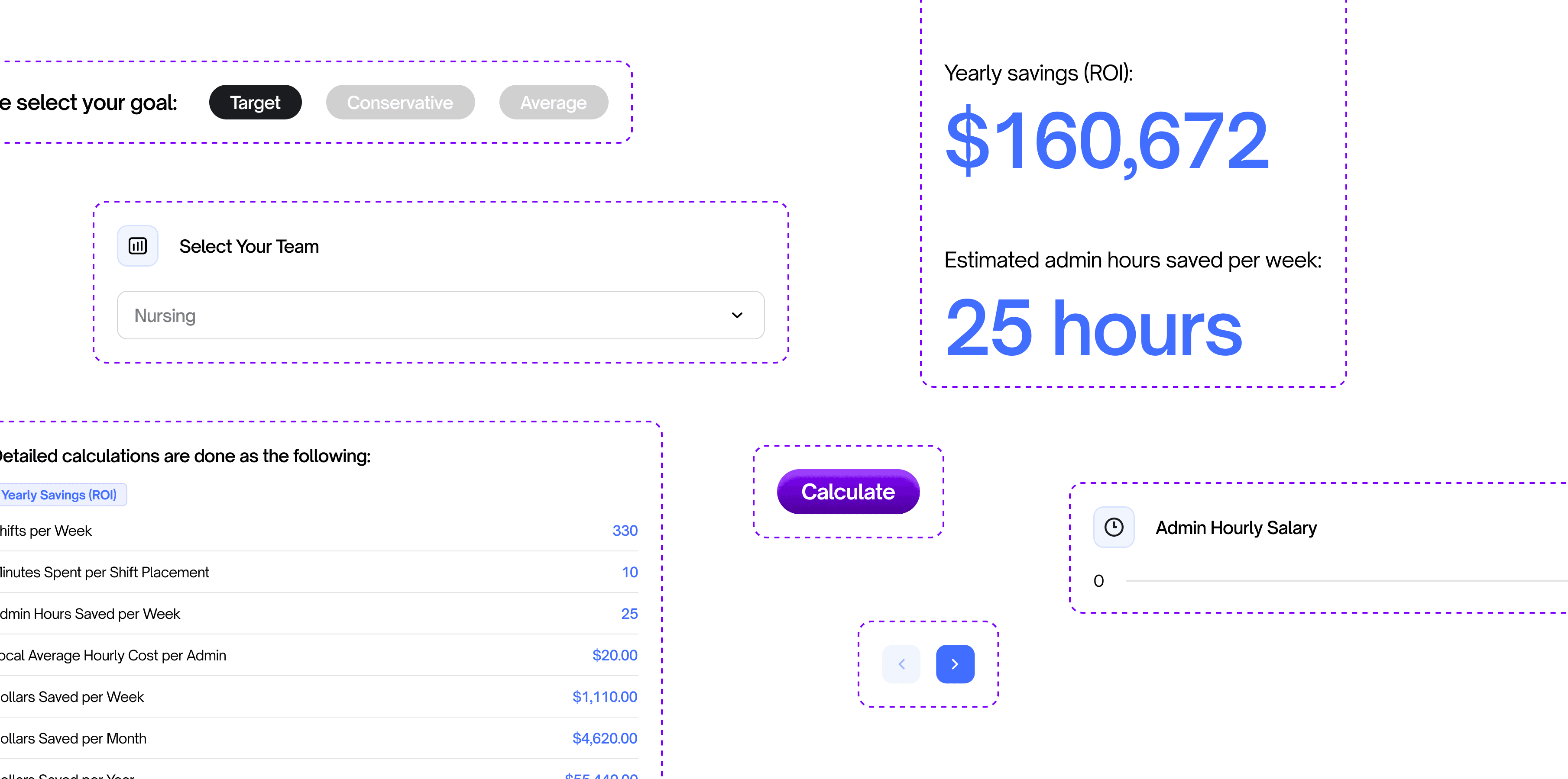
In order to gain user trust, we have added transparency elements, such as the section 'How it's calculated' below, to ensure that no hidden values are implemented on the front and back end.
In order to gain user trust, we have added transparency elements, such as the section 'How it's calculated' below, to ensure that no hidden values are implemented on the front and back end.

Outcomes
Outcomes
Outcomes
01
01
01
Increased User Efficiency
Increased User Efficiency
Post-launch on the dashboard gained potential on decrease on time spent interpreting data due to simplified complexity on the instructions.
Post-launch on the dashboard gained potential on decrease on time spent interpreting data due to simplified complexity on the instructions.
02
02
02
Potential Scalability
Potential Scalability
The modular design has allowed for potential scalability - one example would be adding new metrics, without disrupting the overall layout.
The modular design has allowed for potential scalability - one example would be adding new metrics, without disrupting the overall layout.
03
03
03
Quick Output, Fast Approval
Quick Output, Fast Approval
We were able to deliver the final dashboard in a span of 5-6 days, incorporating a few tweaks based on client requests.
We were able to deliver the final dashboard in a span of 5-6 days, incorporating a few tweaks based on client requests.
With the points of measured success mentioned above, here are the valuable insights that we have gained from the project:
With the points of measured success mentioned above, here are the valuable insights that we have gained from the project:
With the points of measured success mentioned above, here are the valuable insights that we have gained from the project:
Less is More
Less is More
A stripped-back UI with ample white space helped users focus on actionable insights, not raw numbers. This has allowed for easier usage due to decrease of clutter.
A stripped-back UI with ample white space helped users focus on actionable insights, not raw numbers. This has allowed for easier usage due to decrease of clutter.
Scaling to Success
Scaling to Success
Within UI design, it's crucial to add scalable elements in case if the client would like to implement new features in the future, which allows for decreased time for back-and-forths as the existing element can be used.
Within UI design, it's crucial to add scalable elements in case if the client would like to implement new features in the future, which allows for decreased time for back-and-forths as the existing element can be used.
Transparency is Key
Transparency is Key
Transparency plays an important place when designing for users, as it allows gained user trust, which can greatly increase positive metrics over time.
Transparency plays an important place when designing for users, as it allows gained user trust, which can greatly increase positive metrics over time.
This project proved that even the driest data can tell a compelling story. By treating the dashboard as a “conversation” between administrators and their metrics, we turned overwhelm into empowerment—one clean, green dollar figure at a time.
This project proved that even the driest data can tell a compelling story. By treating the dashboard as a “conversation” between administrators and their metrics, we turned overwhelm into empowerment—one clean, green dollar figure at a time.
This project proved that even the driest data can tell a compelling story. By treating the dashboard as a “conversation” between administrators and their metrics, we turned overwhelm into empowerment—one clean, green dollar figure at a time.
What problems are you looking to solve today?
What problems are you looking to solve today?
Start off by contacting kingto.design@gmail.com - and let’s discuss from there!
Start off by contacting kingto.design@gmail.com -
and let’s discuss from there!
What problems are you looking to solve today?
Start off by contacting kingto.design@gmail.com -
and let’s discuss from there!