Where Creatives and Analysts Unite Under One Bold Banner
Where Creatives and Analysts Unite Under One Bold Banner
Where Creatives and Analysts Unite Under One Bold Banner
How we envisioned, and created a forwarding-moving visual identity for Group Z Collective, a multidisciplinary collective of DJs, Designers, and Analysts - By blending geometric shapes, vibrant orange-and-black palettes, and modular design systems, we created a scalable identity that supported 5 successful events in 7 months and expanded the collective’s network by 40%.
How we envisioned, and created a forwarding-moving visual identity for Group Z Collective, a multidisciplinary collective of DJs, Designers, and Analysts - By blending geometric shapes, vibrant orange-and-black palettes, and modular design systems, we created a scalable identity that supported 5 successful events in 7 months and expanded the collective’s network by 40%.
How we envisioned, and created a forwarding-moving visual identity for Group Z Collective, a multidisciplinary collective of DJs, Designers, and Analysts - By blending geometric shapes, vibrant orange-and-black palettes, and modular design systems, we created a scalable identity that supported 5 successful events in 7 months and expanded the collective’s network by 40%.
Client
Client
Group Z Collective
Group Z Collective
Project Year
Project Year
2024
2024
Project Type
Project Type
Visual Identity, Generative AI
Visual Identity, Generative AI
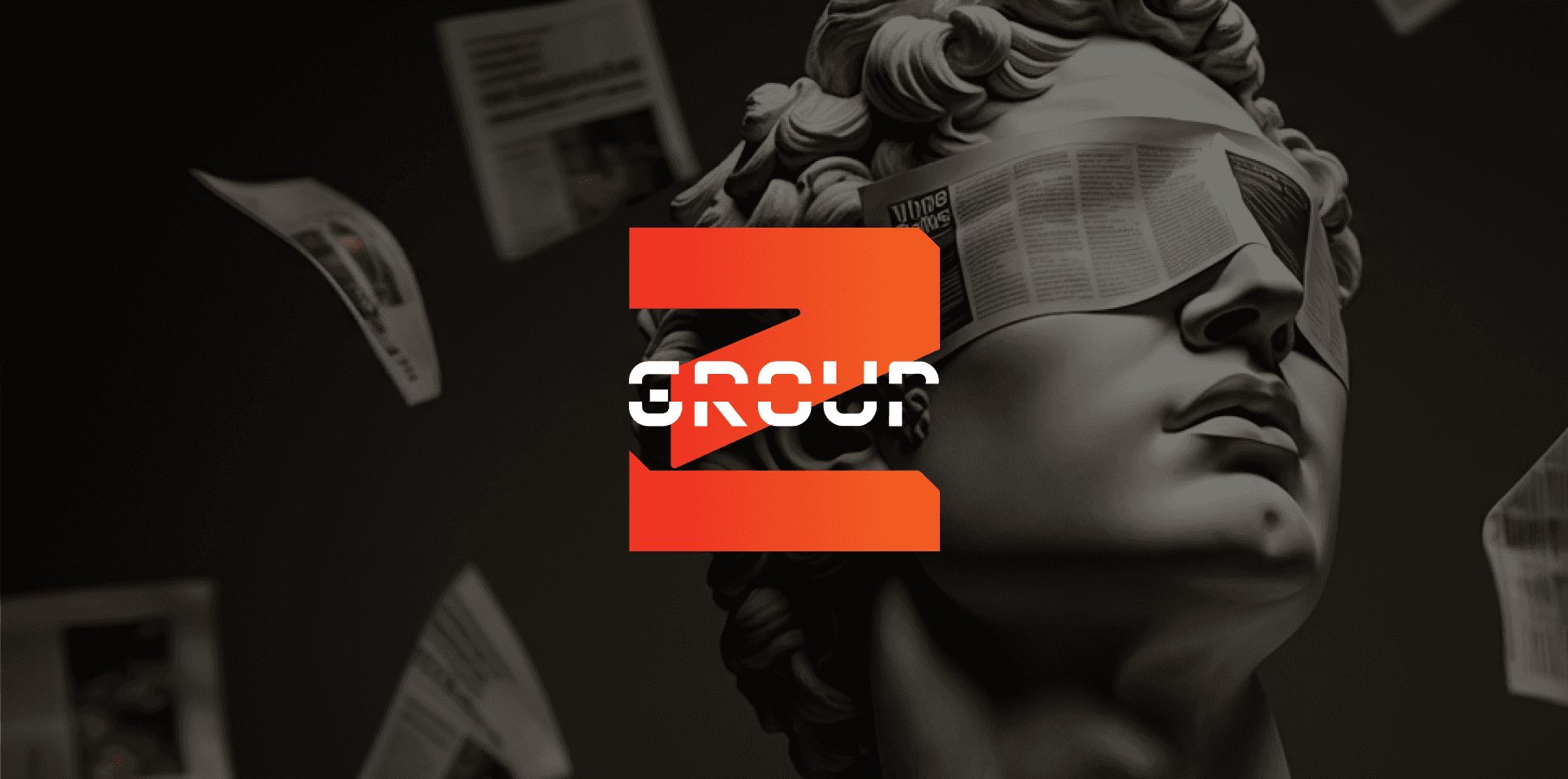
The client, a seasoned organizer of Japanese pop-culture events, sought to launch Group Z Collective — a multidisciplinary collective uniting DJs, music producers, designers, and analysts — to expand beyond their niche audience into broader, non-Japanese markets.
The challenge was twofold: craft a brand identity that reflected the collective’s bold, forward-moving ethos while accommodating the diverse personalities of its members, and position Group Z as a dynamic force in Jakarta’s competitive event scene. Existing local designs leaned heavily on anime aesthetics, so the identity needed to feel fresh, experimental, and inclusive to attract both creatives and analytical minds.
Here’s how we achieved success:
The client, a seasoned organizer of Japanese pop-culture events, sought to launch Group Z Collective — a multidisciplinary collective uniting DJs, music producers, designers, and analysts — to expand beyond their niche audience into broader, non-Japanese markets.
The challenge was twofold: craft a brand identity that reflected the collective’s bold, forward-moving ethos while accommodating the diverse personalities of its members, and position Group Z as a dynamic force in Jakarta’s competitive event scene. Existing local designs leaned heavily on anime aesthetics, so the identity needed to feel fresh, experimental, and inclusive to attract both creatives and analytical minds.
Here’s how we achieved success:
The client, a seasoned organizer of Japanese pop-culture events, sought to launch Group Z Collective — a multidisciplinary collective uniting DJs, music producers, designers, and analysts — to expand beyond their niche audience into broader, non-Japanese markets.
The challenge was twofold: craft a brand identity that reflected the collective’s bold, forward-moving ethos while accommodating the diverse personalities of its members, and position Group Z as a dynamic force in Jakarta’s competitive event scene. Existing local designs leaned heavily on anime aesthetics, so the identity needed to feel fresh, experimental, and inclusive to attract both creatives and analytical minds.
Here’s how we achieved success:
Key Solutions
Key Solutions
Creation of Logo and Modular System
Member-Centric Design
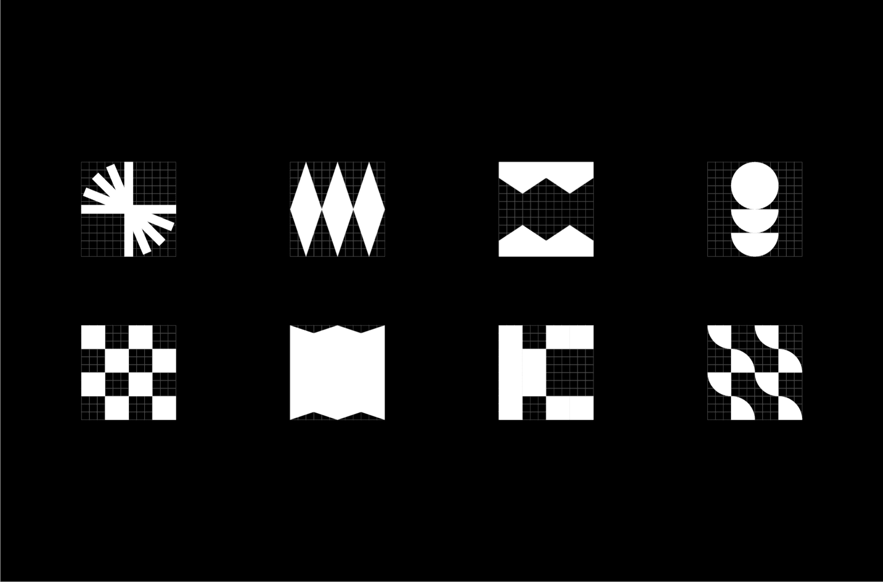
Designed a geometric “Z” icon with intersecting lines, symbolizing interconnected talents. Expanded this into shapes (triangles, hexagons) representing members’ unique roles.
Designed a geometric “Z” icon with intersecting lines, symbolizing interconnected talents. Expanded this into shapes (triangles, hexagons) representing members’ unique roles.
Member-Centric Design
Creation of Logo and Modular System
Each member received a geometric shape (e.g., DJs = soundwave triangles, analysts = data-driven hexagons), fostering individuality within unity.
Designed a geometric “Z” icon with intersecting lines, symbolizing interconnected talents. Expanded this into shapes (triangles, hexagons) representing members’ unique roles.
AI-Generated Image Direction
AI-Generated Image Direction
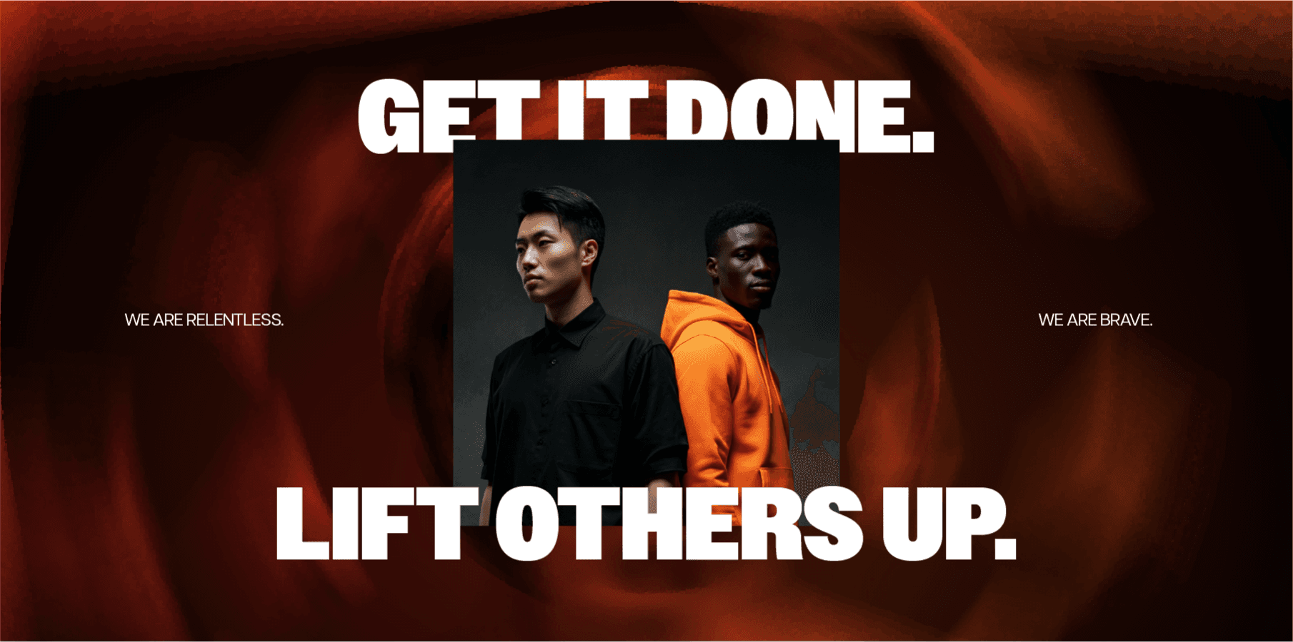
While image direction needs to be quick, we took advantage of Visual Electric, which allowed it to generate our desired image direction - bold, diverse, forward-moving.
While image direction needs to be quick, we took advantage of Visual Electric, which allowed it to generate our desired image direction - bold, diverse, forward-moving.
Role and Process
Role and Process
Role and Process
As the Brand Identity Designer, I collaborated on concept development and execution, translating the client’s vision of "planning to the last letter Z" into a cohesive visual system.
Research & Execution
Research & Execution
Research & Execution
Research on Current Audiences
Research on Current Audiences
To kickstart the project, we first analyzed Jakarta’s event trends, identifying a gap for designs blending Japanese precision with global experimentalism.
To kickstart the project, we first analyzed Jakarta’s event trends, identifying a gap for designs blending Japanese precision with global experimentalism.
Exploration on Identity Values
Exploration on Identity Values
Coined Group Z Collective to symbolize meticulous planning (“to the last letter”) and unity. Brand pillars included collaboration, innovation, and diversity.
Coined Group Z Collective to symbolize meticulous planning (“to the last letter”) and unity. Brand pillars included collaboration, innovation, and diversity.
Wordplay Elements
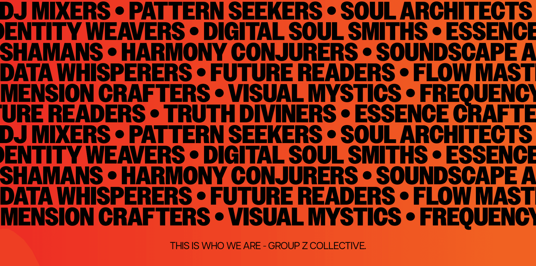
Visual Direction to Scale
Visual Direction to Scale
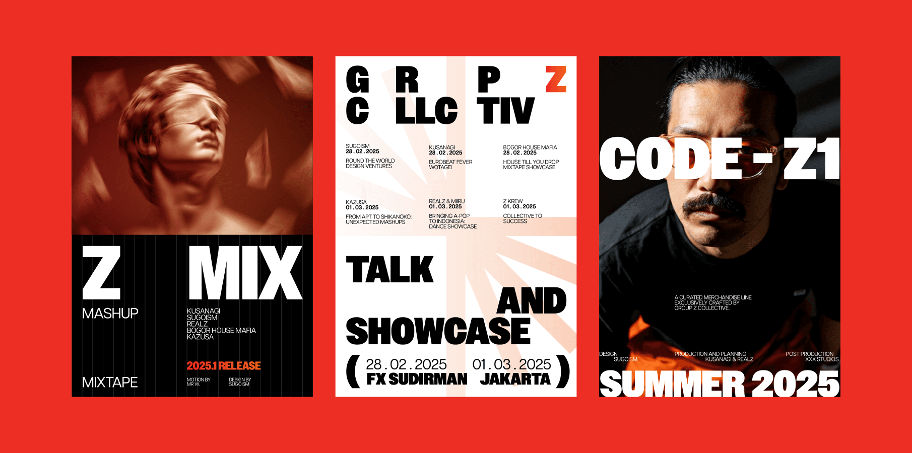
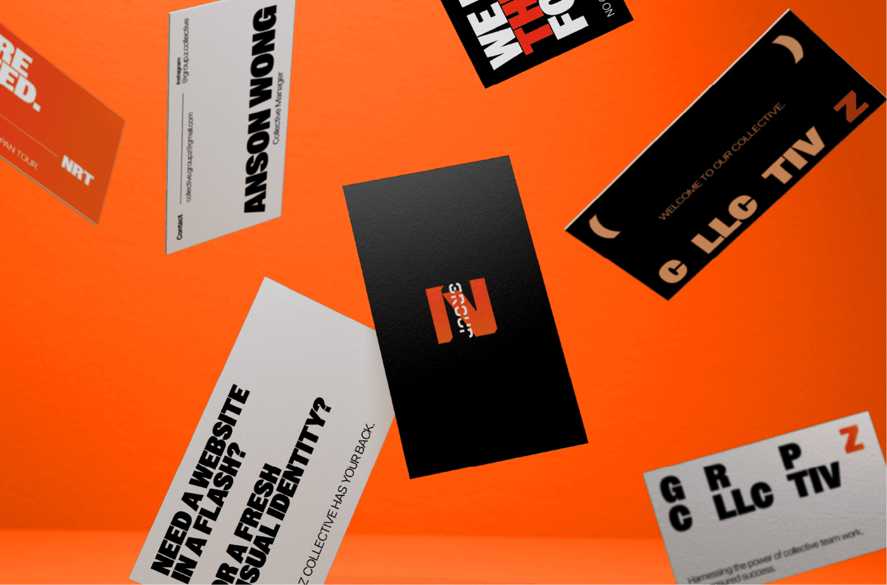
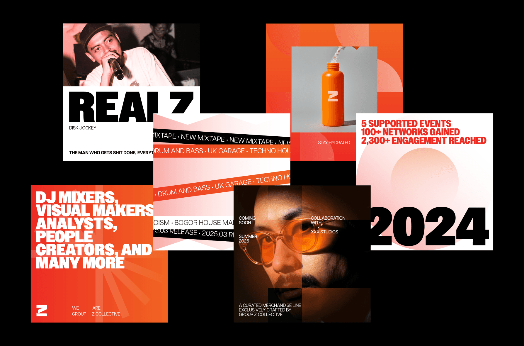
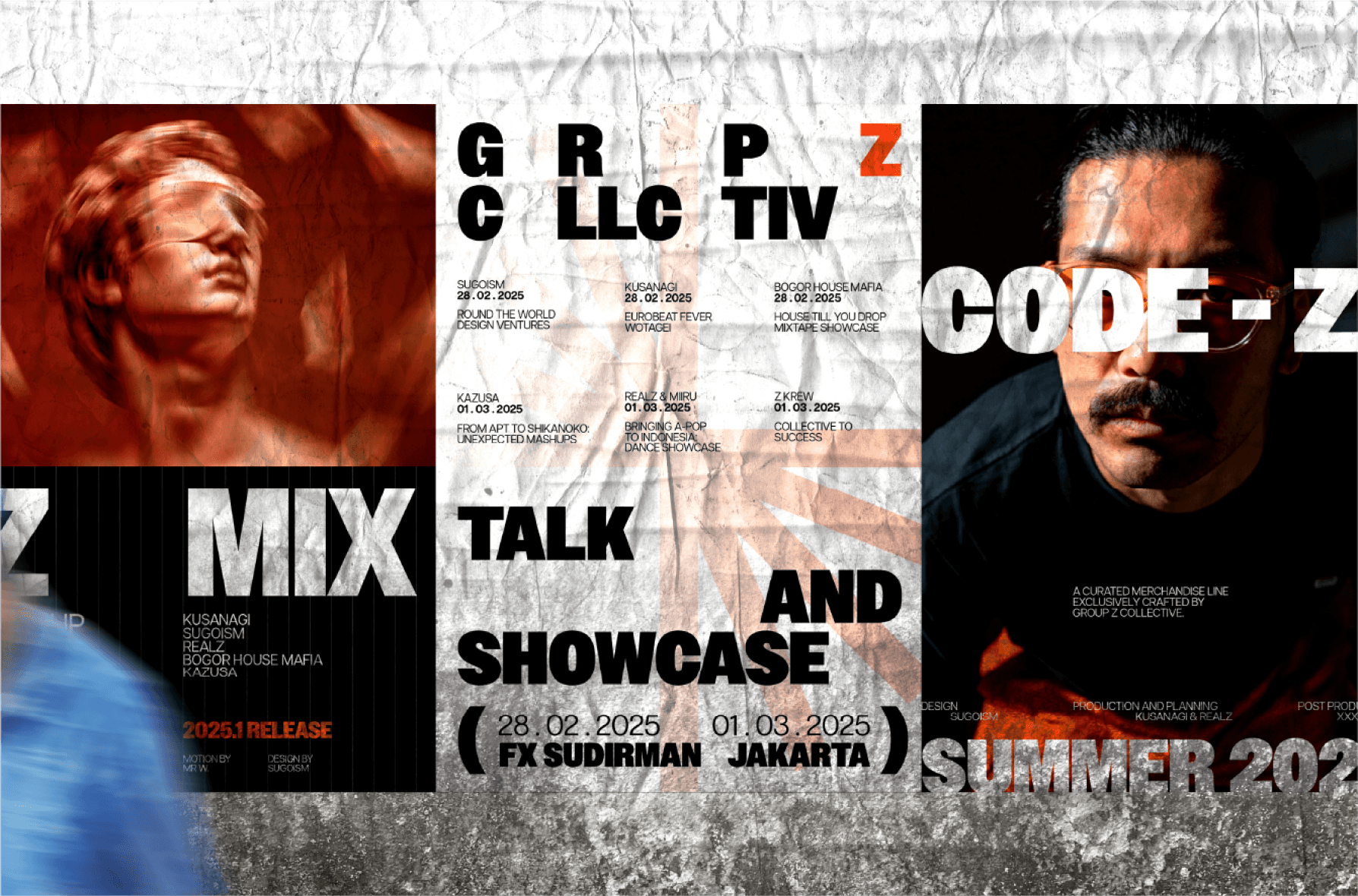
Pitched a vibrant orange and black palette— orange for energy, black for boldness—paired with angular typography to mirror the collective’s edgy, forward-moving spirit.
Pitched a vibrant orange and black palette— orange for energy, black for boldness—paired with angular typography to mirror the collective’s edgy, forward-moving spirit.
Outcomes
Outcomes
Outcomes
01
01
01
Success on Events and International Outreach
Success on Events and International Outreach
Throughout the span of 5 months, we have successfully launched and supported for more than 7 events in Indonesia, with international outreach to countries such as Malaysia and Japan.
Throughout the span of 5 months, we have successfully launched and supported for more than 7 events in Indonesia, with international outreach to countries such as Malaysia and Japan.
02
02
02
Increased on Social Buzz and Insights
Partnerships on Local and International-scaled Events
Increase of recommendations or partnerships on local and international-scaled events, such as Comic Frontier, Indonesia Comic Con, expanding the collective's network further.
Increase of recommendations or partnerships on local and international-scaled events, such as Comic Frontier, Indonesia Comic Con, expanding the collective's network further.
03
03
03
Further Partnership on Design and Marketing
Potential on Expansion of Visual Identity
This allows for us to potentially expand Group Z Collective's identity further, as time goes where members of the collective will be added.
Praised for “translating our ambition into a visual language that feels both cutting-edge and inclusive.”
This allows for us to potentially expand Group Z Collective's identity further, as time goes where members of the collective will be added.
With the points of measured success mentioned above, here are the valuable insights that we have gained from the project:
With the points of measured success mentioned above, here are the valuable insights that we have gained from the project:
With the points of measured success mentioned above, here are the valuable insights that we have gained from the project:
Cultural Hybrids
Cultural Hybrids
Mixing Japanese and Jakarta aesthetics required balancing simplicity with Jakarta’s preference for vibrancy. This allows for a blend of different cultures together through different design perspectives.
Mixing Japanese and Jakarta aesthetics required balancing simplicity with Jakarta’s preference for vibrancy. This allows for a blend of different cultures together through different design perspectives.
Future-Proofing of Assets
Future-Proofing of Assets
Designing scalable assets upfront let the client onboard new members seamlessly post-launch. This also allows flexibility for the brand to be expressed further, with the seamless availability of design elements.
Designing scalable assets upfront let the client onboard new members seamlessly post-launch. This also allows flexibility for the brand to be expressed further, with the seamless availability of design elements.
Adapting Speed and Quality
Adapting Speed and Quality
While this is a blend of human-made conceptual design and AI, this allows for us to adapt into faster workflows, without the compromise of losing quality, due to the hybrid approach of the work.
While this is a blend of human-made conceptual design and AI, this allows for us to adapt into faster workflows, without the compromise of losing quality, due to the hybrid approach of the work.
Group Z Collective’s identity became a rallying point for Jakarta’s creative-analytic hybrid community. By treating diversity as a design asset, the brand now stands as a symbol of innovation—proving that DJs, designers, and data whisperers can thrive under one bold, orange-and-black banner.
Group Z Collective’s identity became a rallying point for Jakarta’s creative-analytic hybrid community. By treating diversity as a design asset, the brand now stands as a symbol of innovation—proving that DJs, designers, and data whisperers can thrive under one bold, orange-and-black banner.
Group Z Collective’s identity became a rallying point for Jakarta’s creative-analytic hybrid community. By treating diversity as a design asset, the brand now stands as a symbol of innovation—proving that DJs, designers, and data whisperers can thrive under one bold, orange-and-black banner.
What problems are you looking to solve today?
What problems are you looking to solve today?
Start off by contacting kingto.design@gmail.com - and let’s discuss from there!
Start off by contacting kingto.design@gmail.com -
and let’s discuss from there!
What problems are you looking to solve today?
Start off by contacting kingto.design@gmail.com -
and let’s discuss from there!