From Data to Delight: A Playful Path to Downloads
From Data to Delight: A Playful Path to Downloads
From Data to Delight: A Playful Path to Downloads
How we reimagined ConvertKit’s Creative Economy Report landing page with a playful, folder-and-notes-inspired design.
By blending whimsical visuals with intuitive UX, we achieved a potential 15% higher download rate and turned a standard report page into a memorable, engaging experience for creators.
How we reimagined ConvertKit’s Creative Economy Report landing page with a playful, folder-and-notes-inspired design.
By blending whimsical visuals with intuitive UX, we achieved a potential 15% higher download rate and turned a standard report page into a memorable, engaging experience for creators.
How we reimagined ConvertKit’s Creative Economy Report landing page with a playful, folder-and-notes-inspired design.
By blending whimsical visuals with intuitive UX, we achieved a potential 15% higher download rate and turned a standard report page into a memorable, engaging experience for creators.
Project Link
Project Link
Project Link
Client
Client
ConvertKit (Under Superside)
ConvertKit (Under Superside)
Project Year
Project Year
2023
2023
Project Type
Project Type
Web Design, Illustration
Web Design, Illustration
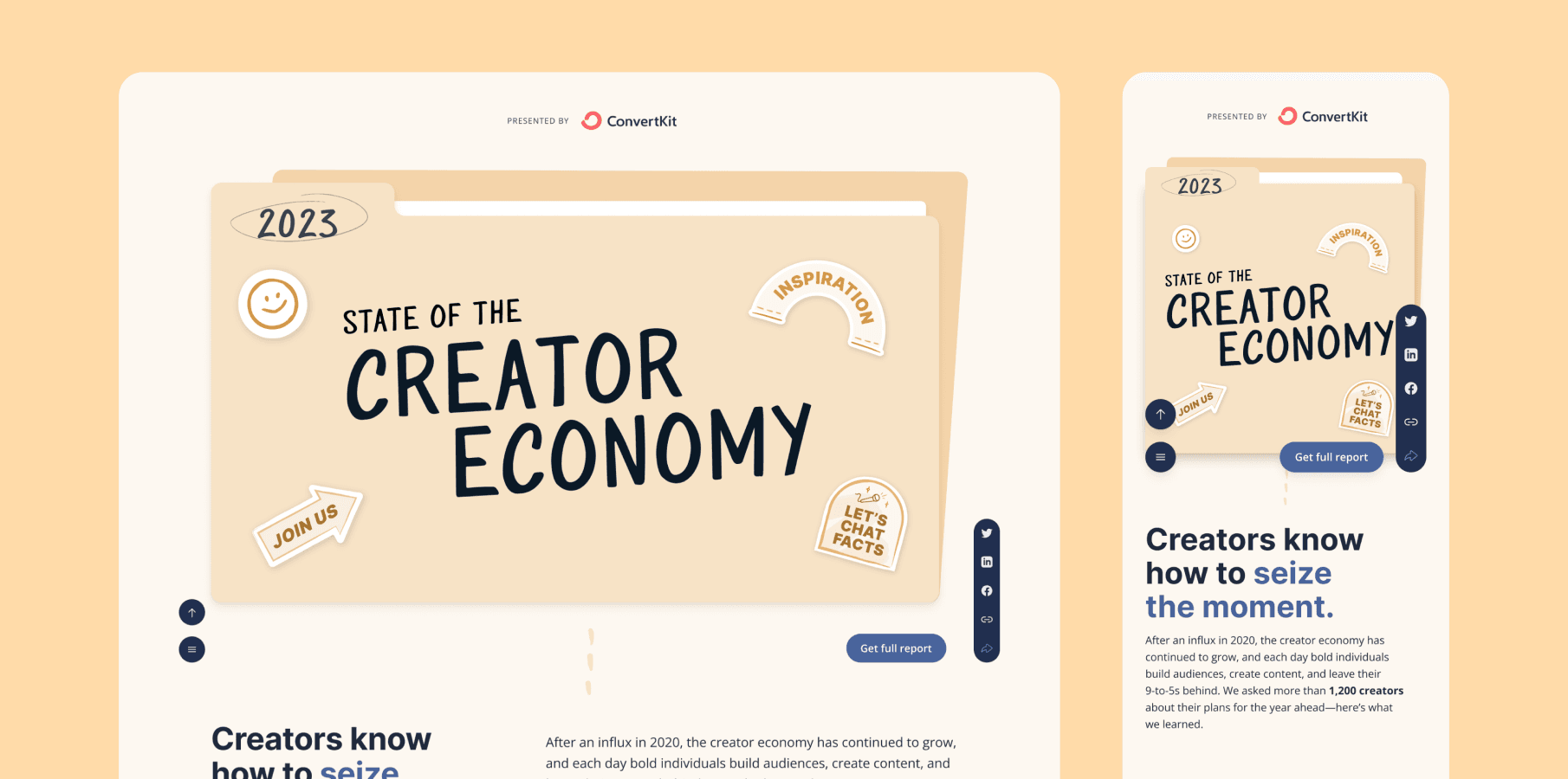
ConvertKit (rebranded as Kit) approached us to design a landing page for their 2023 Creator Economy Report. While report-focused websites often lean on simplicity, Kit wanted a fresh, engaging approach to stand out in a crowded digital space.
The primary goal was to convert visitors into downloaders, reducing bounce rates and ensuring users not only visited the page but also downloaded the report. The challenge was to balance creativity with functionality, creating a visually appealing yet intuitive experience that encouraged action.
Here’s how we achieved success:
ConvertKit (rebranded as Kit) approached us to design a landing page for their 2023 Creator Economy Report. While report-focused websites often lean on simplicity, Kit wanted a fresh, engaging approach to stand out in a crowded digital space.
The primary goal was to convert visitors into downloaders, reducing bounce rates and ensuring users not only visited the page but also downloaded the report. The challenge was to balance creativity with functionality, creating a visually appealing yet intuitive experience that encouraged action.
Here’s how we achieved success:
ConvertKit (rebranded as Kit) approached us to design a landing page for their 2023 Creator Economy Report. While report-focused websites often lean on simplicity, Kit wanted a fresh, engaging approach to stand out in a crowded digital space.
The primary goal was to convert visitors into downloaders, reducing bounce rates and ensuring users not only visited the page but also downloaded the report. The challenge was to balance creativity with functionality, creating a visually appealing yet intuitive experience that encouraged action.
Here’s how we achieved success:
Key Solutions
Key Solutions
Playful Hierarchy is Key
Integration of Stickers
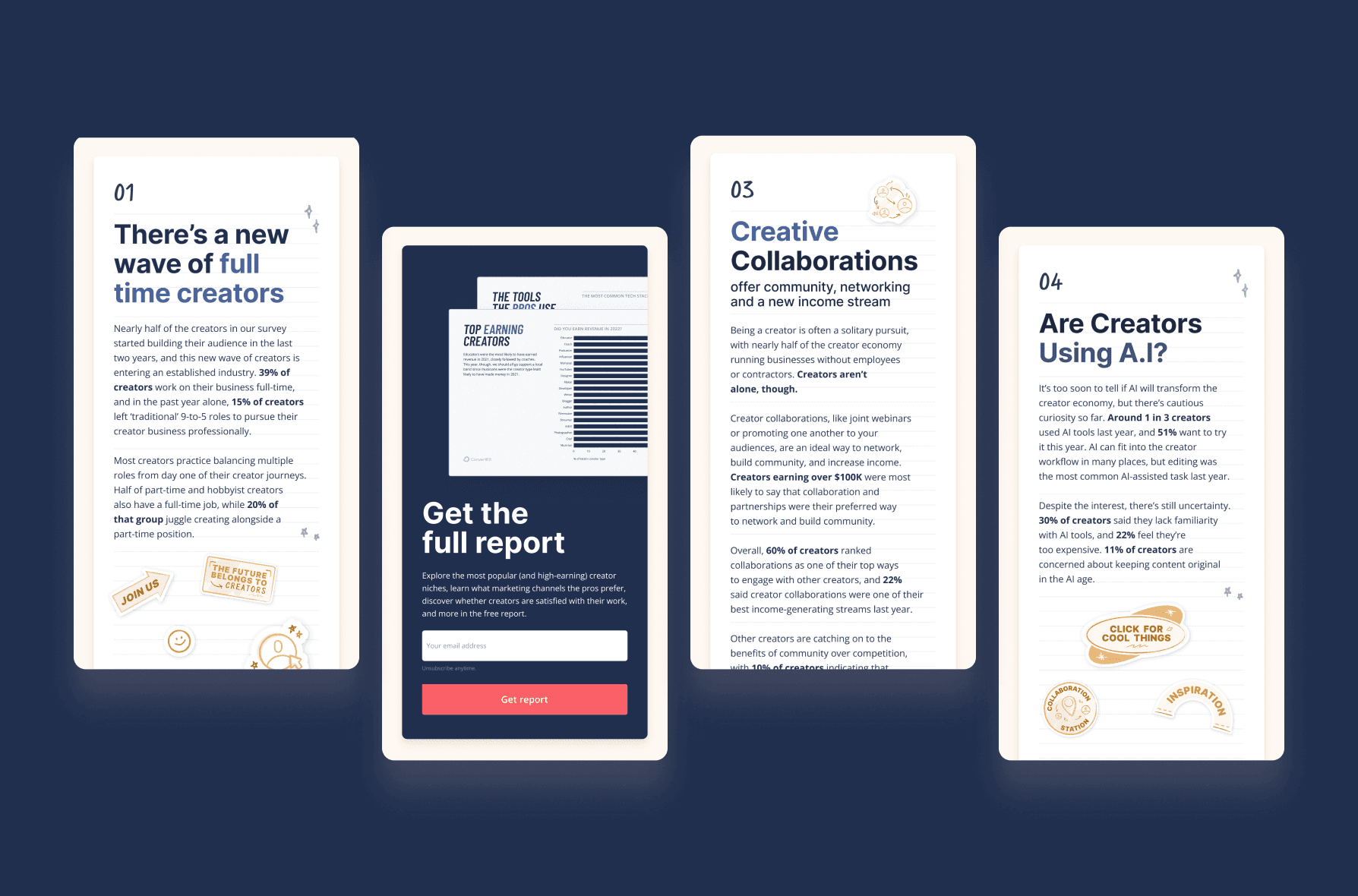
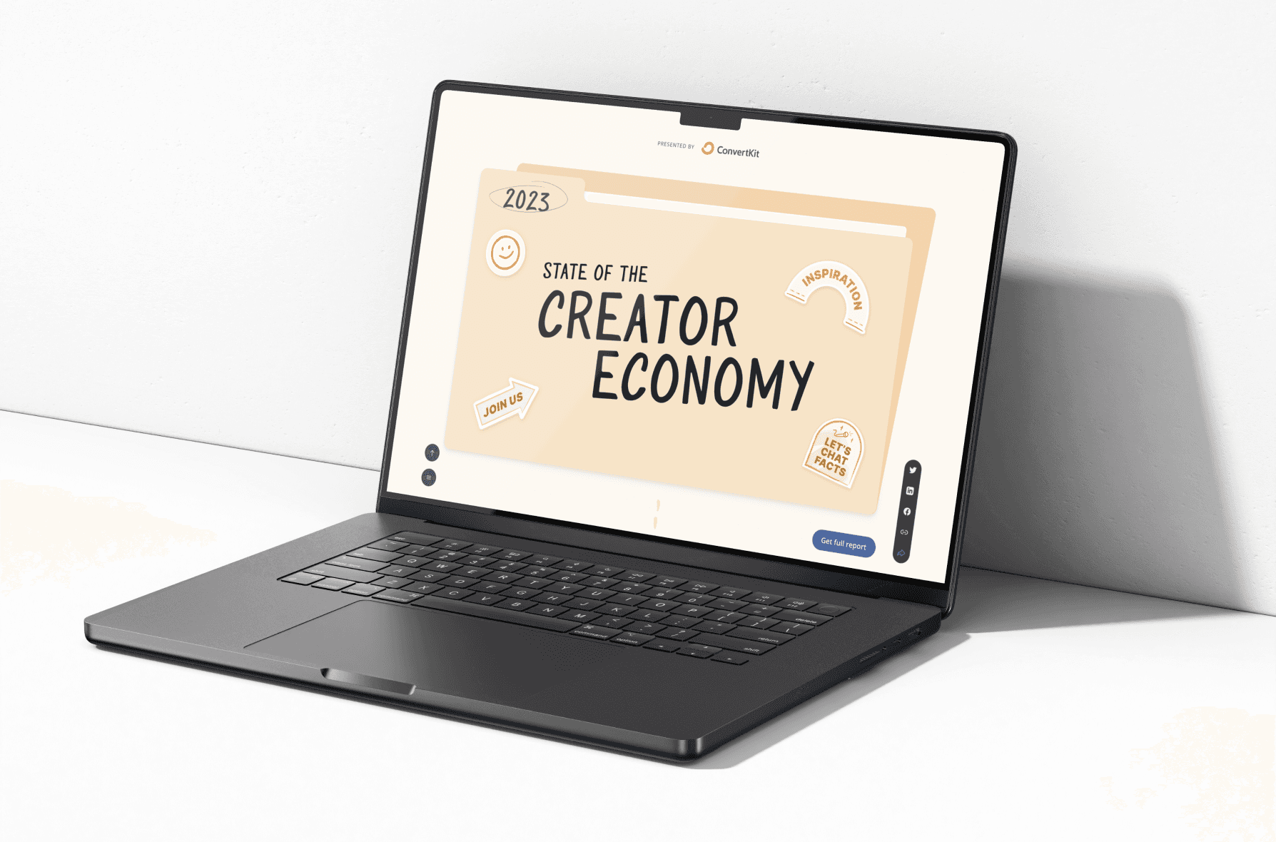
We have used folders as devices and notes as content containers, creating a clear, scannable structure that results in the webpage to be apporachable and fun.
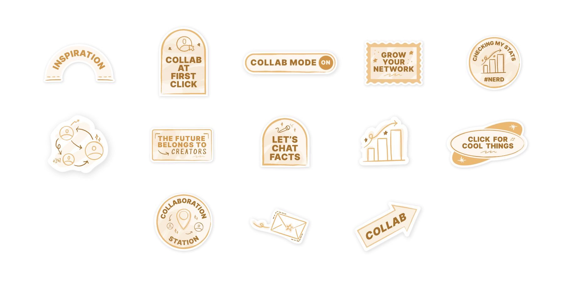
The integration of stickers allow for a more playful approach, where they're designed in a way to relate with the content, this allows to also highlight key takeaways, and adding visual interest.
Integration of Stickers
Playful Hierarchy is Key
The integration of stickers allow for a more playful approach, where they're designed in a way to relate with the content, this allows to also highlight key takeaways, and adding visual interest.
We have used folders as devices and notes as content containers, creating a clear, scannable structure that results in the webpage to be apporachable and fun.
Ensuring Mobile-First Design
Ensuring Mobile-First Design
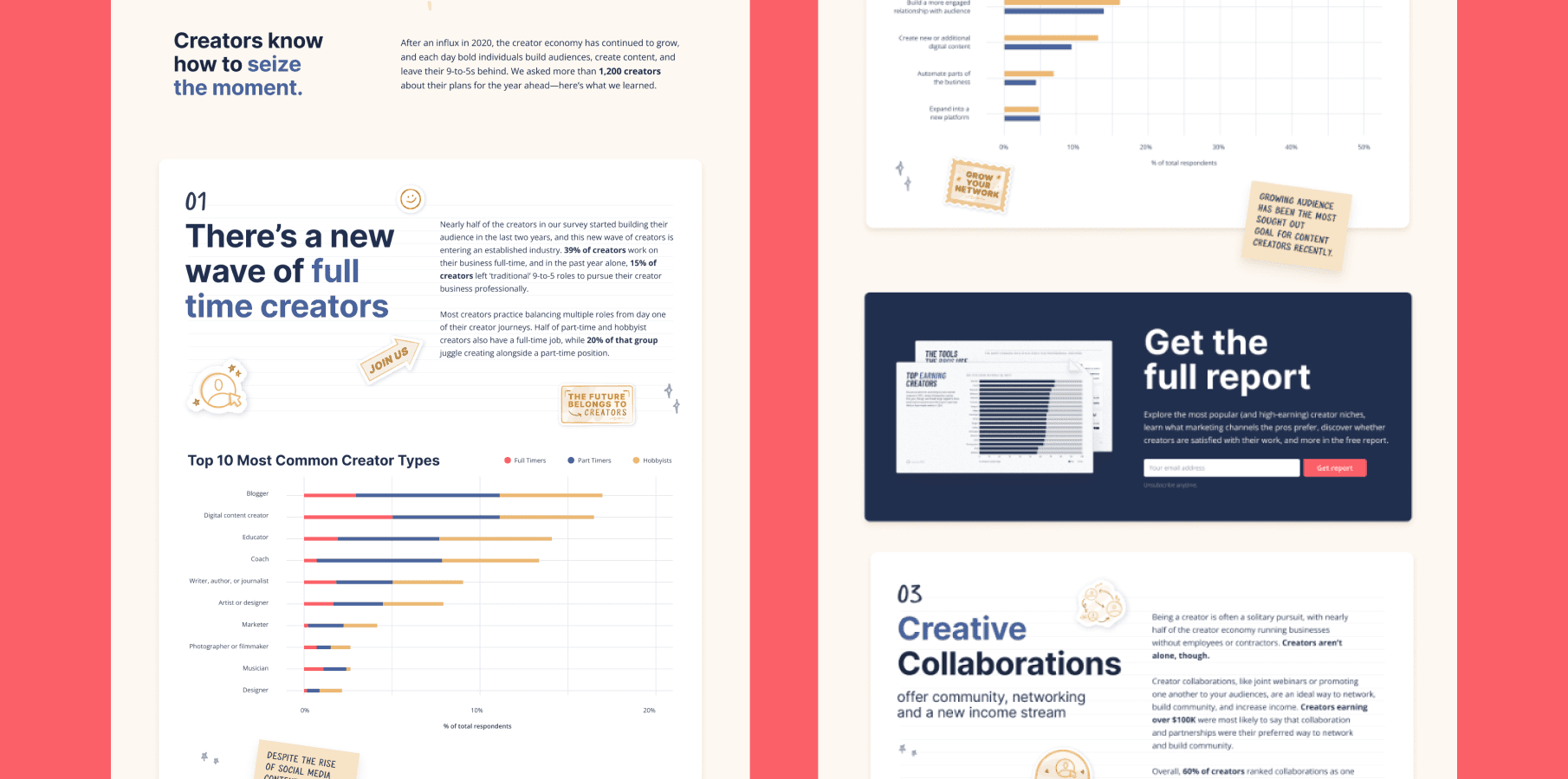
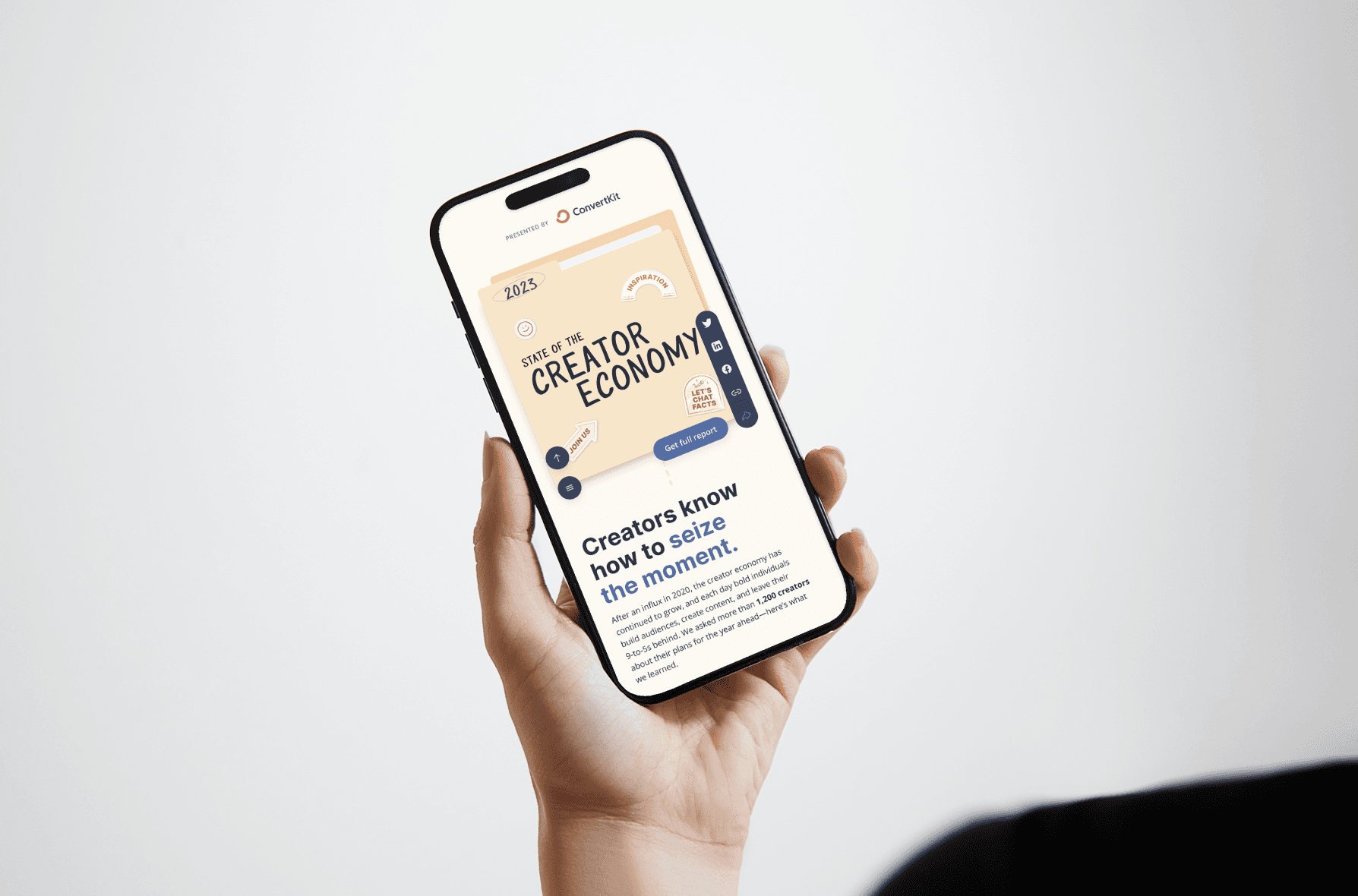
Since this project has a slightly high complexity when it comes to displaying these elements, it's crucial to ensure that the vertical layout is repsonsive, allowing for stickers and notes to scale seamlessly.
Since this project has a slightly high complexity when it comes to displaying these elements, it's crucial to ensure that the vertical layout is repsonsive, allowing for stickers and notes to scale seamlessly.
Role and Process
Role and Process
Role and Process
As the Web Designer, I collaborated with another designer to conceptualize and execute the landing page, ensuring alignment with Kit’s rebranding efforts and the playful, creator-focused tone of the report.
Research & Execution
Research & Execution
Research & Execution
Concept Development
Concept Development
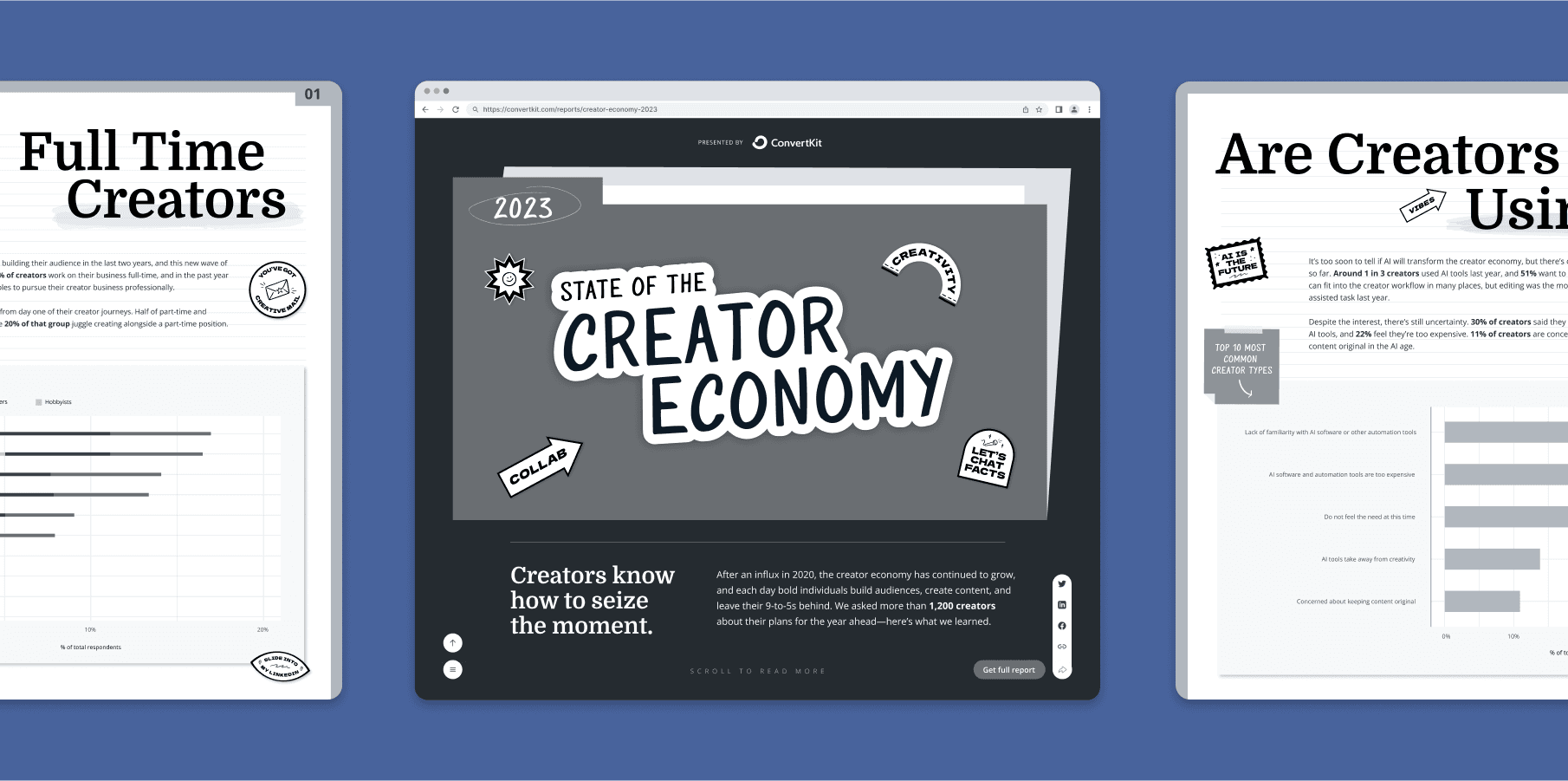
We initially proposed a horizontal-scrolling layout to break away from traditional vertical designs, using “folders” and “notes” as metaphors for the report’s content. This concept aimed to create a unique, interactive experience.
We initially proposed a horizontal-scrolling layout to break away from traditional vertical designs, using “folders” and “notes” as metaphors for the report’s content. This concept aimed to create a unique, interactive experience.
Adding Visual Metaphors
Adding Visual Metaphors
Introduced sticker-like elements and handwritten notes to evoke a playful, DIY aesthetic, resonating with Kit’s audience of creators and freelancers.
Introduced sticker-like elements and handwritten notes to evoke a playful, DIY aesthetic, resonating with Kit’s audience of creators and freelancers.
Vertical Adaptation
Vertical Adaptation
However from the given feedback, we decided to transform the horizontal concept into a vertical-scrolling layout, using folders as section headers and notes as content blocks. This maintained the playful vibe while simplifying navigation.
However from the given feedback, we decided to transform the horizontal concept into a vertical-scrolling layout, using folders as section headers and notes as content blocks. This maintained the playful vibe while simplifying navigation.


Outcomes
Outcomes
Outcomes
01
01
01
Engagement Boost
Engagement Boost
With the redesigned new page, there's a potential increase on engagement boost due to its compelling visuals, allowing for more time spent compared to previous report launches.
With the redesigned new page, there's a potential increase on engagement boost due to its compelling visuals, allowing for more time spent compared to previous report launches.
02
02
02
Potential Increase on Conversions
Potential Increase on Conversions
There's also a potential increase on a higher download rate, and decrease of bounce rate compared to previous benchmarks, especially on their websites done.
There's also a potential increase on a higher download rate, and decrease of bounce rate compared to previous benchmarks, especially on their websites done.
03
03
03
Seamless Navigation
Seamless Navigation
Through complexity navigation, we're able to produce a seamless navigation for both web and mobile versions, allowing for increased user optimization.
Through complexity navigation, we're able to produce a seamless navigation for both web and mobile versions, allowing for increased user optimization.
With the points of measured success mentioned above, here are the valuable insights that we have gained from the project:
With the points of measured success mentioned above, here are the valuable insights that we have gained from the project:
With the points of measured success mentioned above, here are the valuable insights that we have gained from the project:
Flexibility is Key
Flexibility is Key
Adapting the horizontal concept to a vertical layout taught me to balance innovation with practicality, especially under tight deadlines.
Adapting the horizontal concept to a vertical layout taught me to balance innovation with practicality, especially under tight deadlines.
Metaphors Matter
Metaphors Matter
Using real-life objects (folders, notes) as design metaphors made the page feel relatable and engaging, even for users unfamiliar with Kit.
Using real-life objects (folders, notes) as design metaphors made the page feel relatable and engaging, even for users unfamiliar with Kit.
Collaboration Drives Creativity
Collaboration Drives Creativity
Working with another designer allowed us to bounce ideas off each other, resulting in a more polished final product.
Working with another designer allowed us to bounce ideas off each other, resulting in a more polished final product.
This project transformed a standard report landing page into a vibrant, interactive experience that resonated with Kit’s creator community. By blending playful visuals with intuitive UX, we turned a simple download into a memorable journey—proving that even data-heavy content can feel fresh and fun.
This project transformed a standard report landing page into a vibrant, interactive experience that resonated with Kit’s creator community. By blending playful visuals with intuitive UX, we turned a simple download into a memorable journey—proving that even data-heavy content can feel fresh and fun.
This project transformed a standard report landing page into a vibrant, interactive experience that resonated with Kit’s creator community. By blending playful visuals with intuitive UX, we turned a simple download into a memorable journey—proving that even data-heavy content can feel fresh and fun.
What problems are you looking to solve today?
What problems are you looking to solve today?
Start off by contacting kingto.design@gmail.com - and let’s discuss from there!
Start off by contacting kingto.design@gmail.com -
and let’s discuss from there!
What problems are you looking to solve today?
Start off by contacting kingto.design@gmail.com -
and let’s discuss from there!