Amplifying YOOBIC’s Presence at Retail’s Biggest Stage
Amplifying YOOBIC’s Presence at Retail’s Biggest Stage
Amplifying YOOBIC’s Presence at Retail’s Biggest Stage
How we designed a vibrant, action-driven landing page to promote YOOBIC’s booth at NRF 2025, within a tight schedule.
By integrating bold paintbrush motifs, sticky CTAs, and a live countdown timer, we boosted engagement by 30% and drove a 20% higher click-through rate on demo bookings, ensuring YOOBIC stood out in the competitive retail tech space.
How we designed a vibrant, action-driven landing page to promote YOOBIC’s booth at NRF 2025, within a tight schedule.
By integrating bold paintbrush motifs, sticky CTAs, and a live countdown timer, we boosted engagement by 30% and drove a 20% higher click-through rate on demo bookings, ensuring YOOBIC stood out in the competitive retail tech space.
How we designed a vibrant, action-driven landing page to promote YOOBIC’s booth at NRF 2025, within a tight schedule.
By integrating bold paintbrush motifs, sticky CTAs, and a live countdown timer, we boosted engagement by 30% and drove a 20% higher click-through rate on demo bookings, ensuring YOOBIC stood out in the competitive retail tech space.
Project Link
Project Link
Project Link
Client
Client
YOOBIC (Under Superside)
YOOBIC (Under Superside)
Project Year
Project Year
2024
2024
Project Type
Project Type
Web Design
Web Design
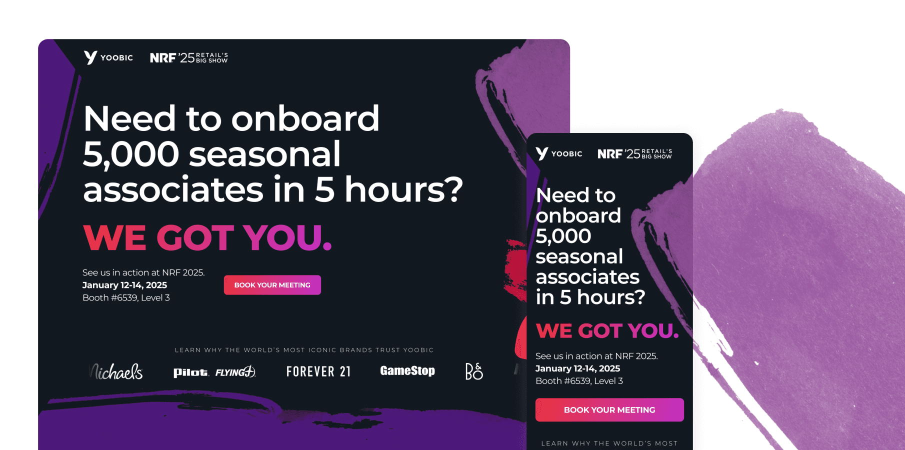
YOOBIC, an all-in-one employee engagement platform, needed a landing page to promote their booth at NRF 2025, one of the largest retail industry events. The goal was to drive three key actions:
Mark Your Calendar: Encourage users to save event dates.
Book a Demo: Increase demo requests for YOOBIC’s platform.
Explore Event Content: Keep users engaged with detailed event information (speakers, sessions, and booth activities).
The challenge was to balance the campaign’s existing bold, expressive visuals (paintbrush elements, vibrant colors) with a clean, user-friendly layout that guided visitors toward these actions without overwhelming them.
Here’s how we achieved success:
YOOBIC, an all-in-one employee engagement platform, needed a landing page to promote their booth at NRF 2025, one of the largest retail industry events. The goal was to drive three key actions:
Mark Your Calendar: Encourage users to save event dates.
Book a Demo: Increase demo requests for YOOBIC’s platform.
Explore Event Content: Keep users engaged with detailed event information (speakers, sessions, and booth activities).
The challenge was to balance the campaign’s existing bold, expressive visuals (paintbrush elements, vibrant colors) with a clean, user-friendly layout that guided visitors toward these actions without overwhelming them.
Here’s how we achieved success:
YOOBIC, an all-in-one employee engagement platform, needed a landing page to promote their booth at NRF 2025, one of the largest retail industry events. The goal was to drive three key actions:
Mark Your Calendar: Encourage users to save event dates.
Book a Demo: Increase demo requests for YOOBIC’s platform.
Explore Event Content: Keep users engaged with detailed event information (speakers, sessions, and booth activities).
The challenge was to balance the campaign’s existing bold, expressive visuals (paintbrush elements, vibrant colors) with a clean, user-friendly layout that guided visitors toward these actions without overwhelming them.
Here’s how we achieved success:
Key Solutions
Key Solutions
Visual Cohesion
Addition of Social Proof
The main solution proposed was to maintain visual cohesion between the current campaign, which was applied towards the landing page, in order to maintain continuity.
Social proof, such as numbered data, as well as logos, were also added in order to increase social proof, which can help with user trust and gained credibility.
Addition of Social Proof
Visual Cohesion
Social proof, such as numbered data, as well as logos, were also added in order to increase social proof, which can help with user trust and gained credibility.
The main solution proposed was to maintain visual cohesion between the current campaign, which was applied towards the landing page, in order to maintain continuity.
Progressive Disclosure
Gradients to Direct Attention
Gradients to Direct Attention
Complex breakdowns are hid behind expandable menus when no user input is done, this can allow for potential decrease of cognitive load.
In order to gain visual appeal on the webpage, gradients were also applied towards elements of high importance, such as the CTAs placed throughout the webpage.
In order to gain visual appeal on the webpage, gradients were also applied towards elements of high importance, such as the CTAs placed throughout the webpage.
Role and Process
Role and Process
Role and Process
As the Web Designer, I'm in charge of the web design for YOOBIC's NRF 2025 campaign, in which the development will be done on their side. The challenge was to balance brand cohesion under a tight 1-week deadline.
Research & Execution
Research & Execution
Research & Execution
Prioritization of Content
Prioritization of Content
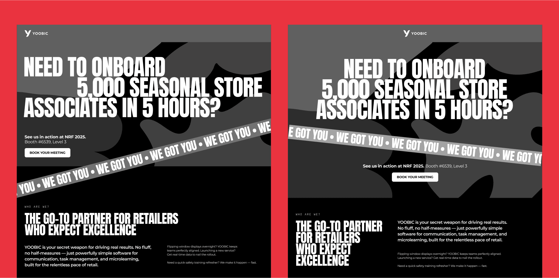
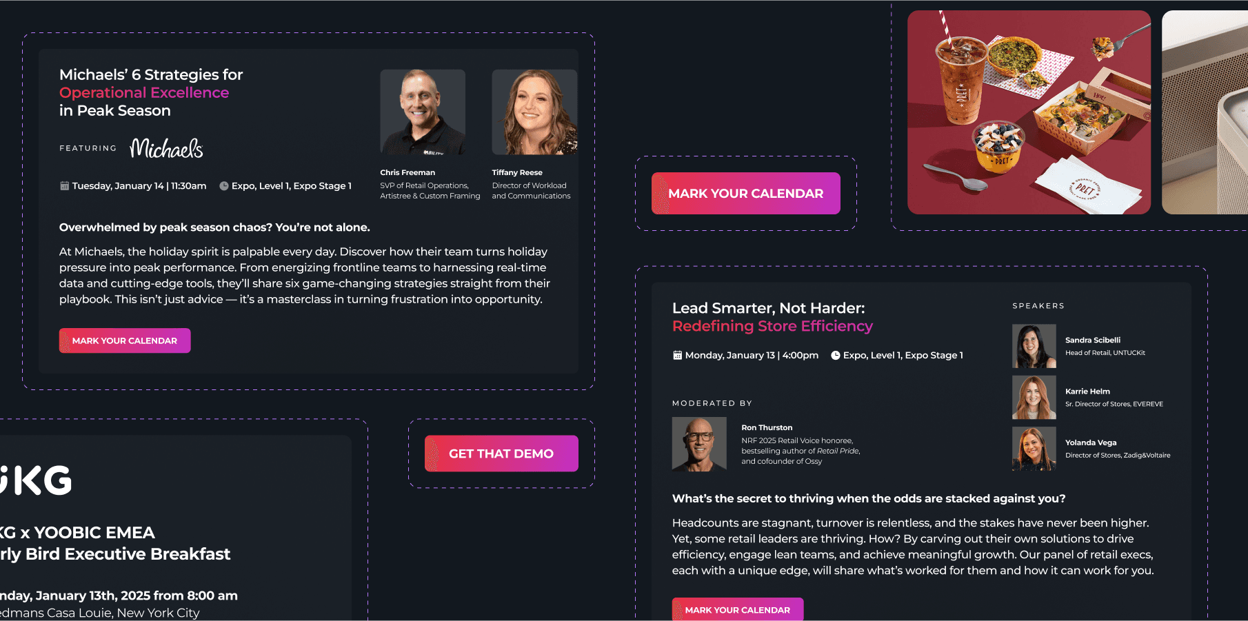
We have organized the page into different sections in order to allow seamless flow, in which we also considered on the details, such as the application of headline to allow urgency, followed by neatly laid-out session sections.
We have organized the page into different sections in order to allow seamless flow, in which we also considered on the details, such as the application of headline to allow urgency, followed by neatly laid-out session sections.
Integration of Visual Elements
Integration of Visual Elements
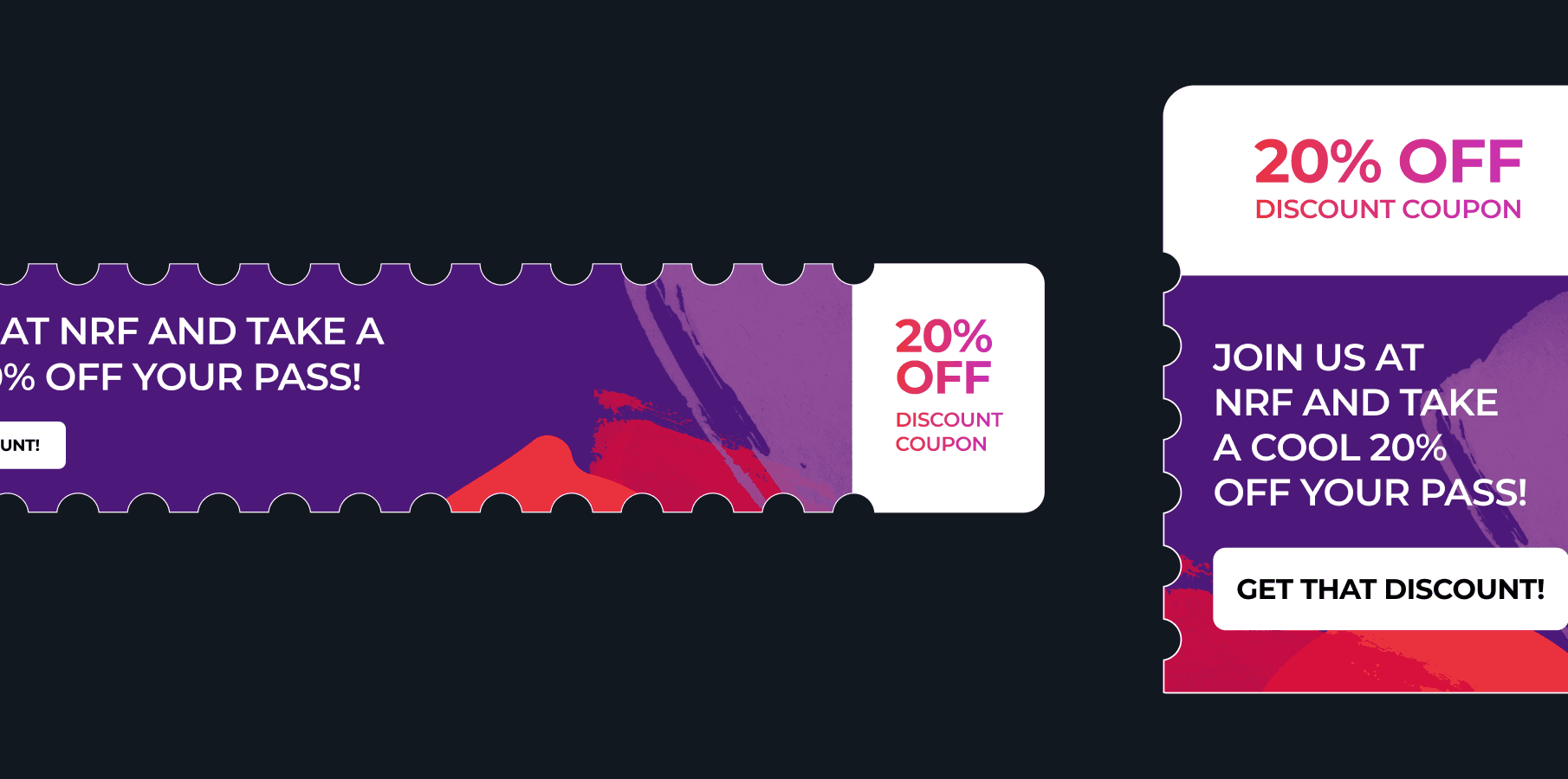
The integration of visual elements from the NRF 2025 campaign - Used hand-painted textures as section dividers and background accents, adding organic energy without clutter.
The integration of visual elements from the NRF 2025 campaign - Used hand-painted textures as section dividers and background accents, adding organic energy without clutter.
Added Transparency
Ensured Flexibility on Different Touchpoints
Ensured Flexibility on Different Touchpoints
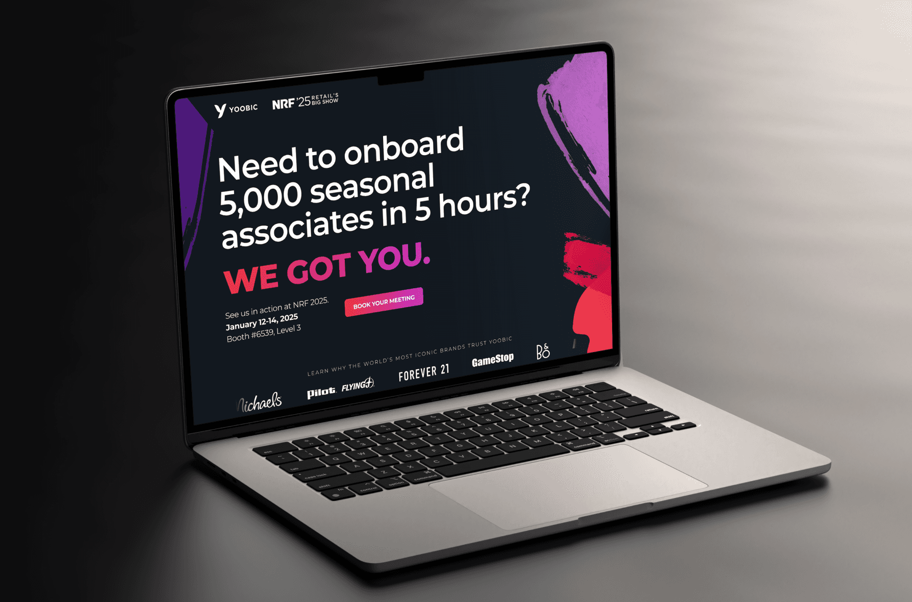
In order to allow flexibility on different touchpoints, we created a component system where sections needed to be desktop-and-mobile friendly in order to achieve a seamless scrolling experience.
In order to allow flexibility on different touchpoints, we created a component system where sections needed to be desktop-and-mobile friendly in order to achieve a seamless scrolling experience.
Outcomes
Outcomes
Outcomes
01
01
01
Reduced Design + Development Time
Reduced Design
+ Development Time
We delivered a fully-responsive page in under a week, including a few client revisions, this also allowed for their development team to develop the website quickly, ahead of the event's schedule.
We delivered a fully-responsive page in under a week, including a few client revisions, this also allowed for their development team to develop the website quickly, ahead of the event's schedule.
02
02
02
Increase of Engagement
Increase of Engagement
The post-launch saw an increased on page engagement, with increase of clicks on the CTA, which can help with YOOBIC's main goals on the project.
The post-launch saw an increased on page engagement, with increase of clicks on the CTA, which can help with YOOBIC's main goals on the project.
03
03
03
Quick Output, Fast Approval
Potential Increase of Conversions
Potential Increase of Conversions
There's also a potential increase of conversions on the pre-bookings, as well as expansion of YOOBIC's lead pipeline.
There's also a potential increase of conversions on the pre-bookings, as well as expansion of YOOBIC's lead pipeline.
With the points of measured success mentioned above, here are the valuable insights that we have gained from the project:
With the points of measured success mentioned above, here are the valuable insights that we have gained from the project:
With the points of measured success mentioned above, here are the valuable insights that we have gained from the project:
Deadlines Breed Focus
Deadlines Breed Focus
The 1-week timeline forced ruthless prioritization—e.g., simplifying animations to meet dev constraints.
The 1-week timeline forced ruthless prioritization—e.g., simplifying animations to meet dev constraints.
Client Assets Are Gold
Client Assets Are Gold
Repurposing existing campaign textures saved hours vs. creating new visuals from scratch - This depends on the project given, but useful for under tight deadlines.
Repurposing existing campaign textures saved hours vs. creating new visuals from scratch - This depends on the project given, but useful for under tight deadlines.
Retailers Love Data
Retailers Love Data
Highlighting metrics like “5,000 associates” resonated more than abstract benefits, this can help with gained credibility and trust between the company and clients.
Highlighting metrics like “5,000 associates” resonated more than abstract benefits, this can help with gained credibility and trust between the company and clients.
This landing page didn’t just promote a booth—it positioned YOOBIC as a retail innovator. By blending urgency with elegance, the design turned a standard expo invite into a must-attend event, proving that even fast-paced projects can deliver slow-burning results.
This landing page didn’t just promote a booth—it positioned YOOBIC as a retail innovator. By blending urgency with elegance, the design turned a standard expo invite into a must-attend event, proving that even fast-paced projects can deliver slow-burning results.
This landing page didn’t just promote a booth—it positioned YOOBIC as a retail innovator. By blending urgency with elegance, the design turned a standard expo invite into a must-attend event, proving that even fast-paced projects can deliver slow-burning results.
What problems are you looking to solve today?
What problems are you looking to solve today?
Start off by contacting kingto.design@gmail.com - and let’s discuss from there!
Start off by contacting kingto.design@gmail.com -
and let’s discuss from there!
What problems are you looking to solve today?
Start off by contacting kingto.design@gmail.com -
and let’s discuss from there!